코드
import openai
import os

from dotenv import load_dotenv, find_dotenv
_ = load_dotenv(find_dotenv())

openai.api_key = os.getenv('ENV_OPENAI_API_KEY')In [2]:
import openai
import os
from dotenv import load_dotenv, find_dotenv
_ = load_dotenv(find_dotenv())
openai.api_key = os.getenv('ENV_OPENAI_API_KEY')In [3]:
import pandas as pd
from pandasai import PandasAI

# Sample DataFrame
df = pd.DataFrame({
    "country": ["United States", "United Kingdom", "France", "Germany", "Italy", "Spain", "Canada", "Australia", "Japan", "China"],
    "gdp": [21400000, 2940000, 2830000, 3870000, 2160000, 1350000, 1780000, 1320000, 516000, 14000000],
    "happiness_index": [7.3, 7.2, 6.5, 7.0, 6.0, 6.3, 7.3, 7.3, 5.9, 5.0]
})

df| country | gdp | happiness_index | |
|---|---|---|---|
| 0 | United States | 21400000 | 7.3 |
| 1 | United Kingdom | 2940000 | 7.2 |
| 2 | France | 2830000 | 6.5 |
| 3 | Germany | 3870000 | 7.0 |
| 4 | Italy | 2160000 | 6.0 |
| 5 | Spain | 1350000 | 6.3 |
| 6 | Canada | 1780000 | 7.3 |
| 7 | Australia | 1320000 | 7.3 |
| 8 | Japan | 516000 | 5.9 |
| 9 | China | 14000000 | 5.0 |
In [4]:
# Instantiate a LLM
from pandasai.llm.openai import OpenAI
llm = OpenAI(api_token=openai.api_key,
             model="gpt-3.5-turbo",
             temperature=0)

pandas_ai = PandasAI(llm)
pandas_ai.run(df, prompt='Which are the 5 happiest countries?')
'According to the data, the top 5 happiest countries are the United States, Canada, Australia, United Kingdom, and Germany.'In [27]:
top_5_values = df.nlargest(5, 'happiness_index')
top_5_values['country'].astype(str)
0 United States
6 Canada
7 Australia
1 United Kingdom
3 Germany
Name: country, dtype: objectIn [5]:
# pandas_ai.run(df, prompt='plot the horizontal bar chart of gpd by all the country and sorted by gdp in a increasing order, using different colors for each bar')
pandas_ai.run(df, prompt='Plot the horizontal bar chart of countries showing for each the gpd, \
                          using different colors for each bar')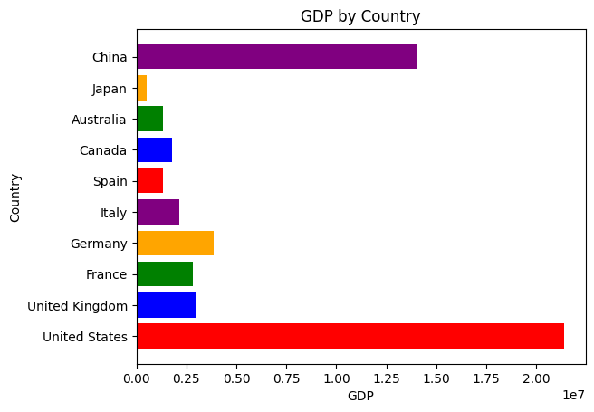
'Sure, I can help you with that! To create a horizontal bar chart of countries showing their GDP, we can use different colors for each bar. Would you like me to guide you through the process?'In [6]:
pandas_ai.run(df, prompt='gdp와 happiness_index 두 변수간의 관계를 산점도로 그려주고 각 점과 겹치지 않게 조금 떨어져 country 라벨을 붙여서 시각화해주세요')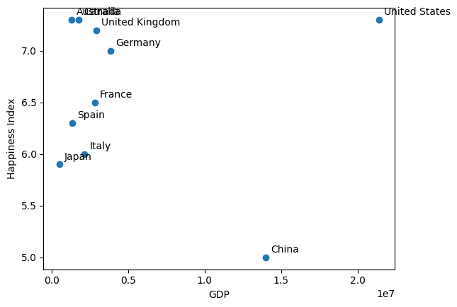
'Can you please create a scatter plot showing the relationship between GDP and happiness index, and label each point with the corresponding country name without overlapping?'